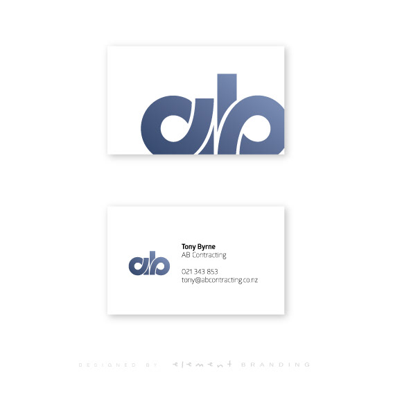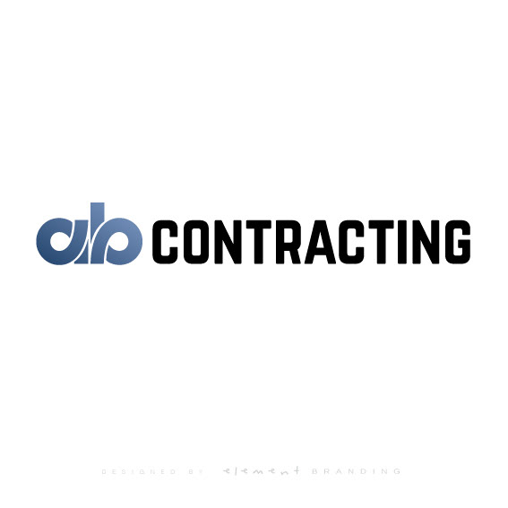
AB Contracting wanted a updated look moving forward. The challenge with the brief was that the logo needed to be designed in a way that would be suitable in many applications including being signwritten onto the boom of excavators and diggers.
The solution was to have a long landscape style layout and the heights kept low including the ascending line of the 'b'. The 'ab' is also stylized into roads/highways to emphasize the contracting industry AB Contracting works within.