
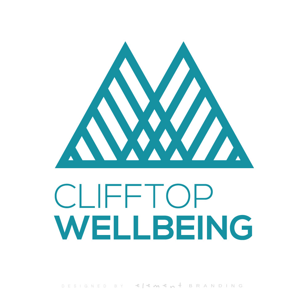
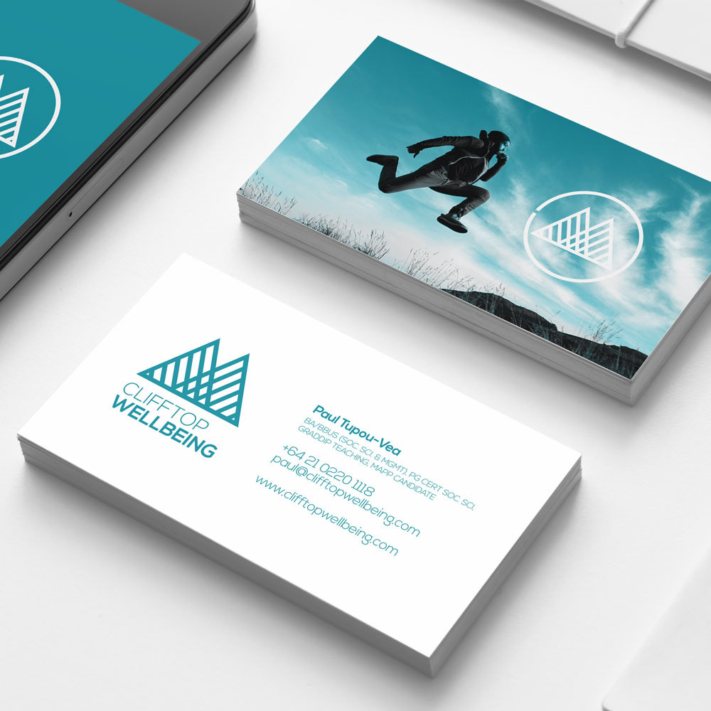
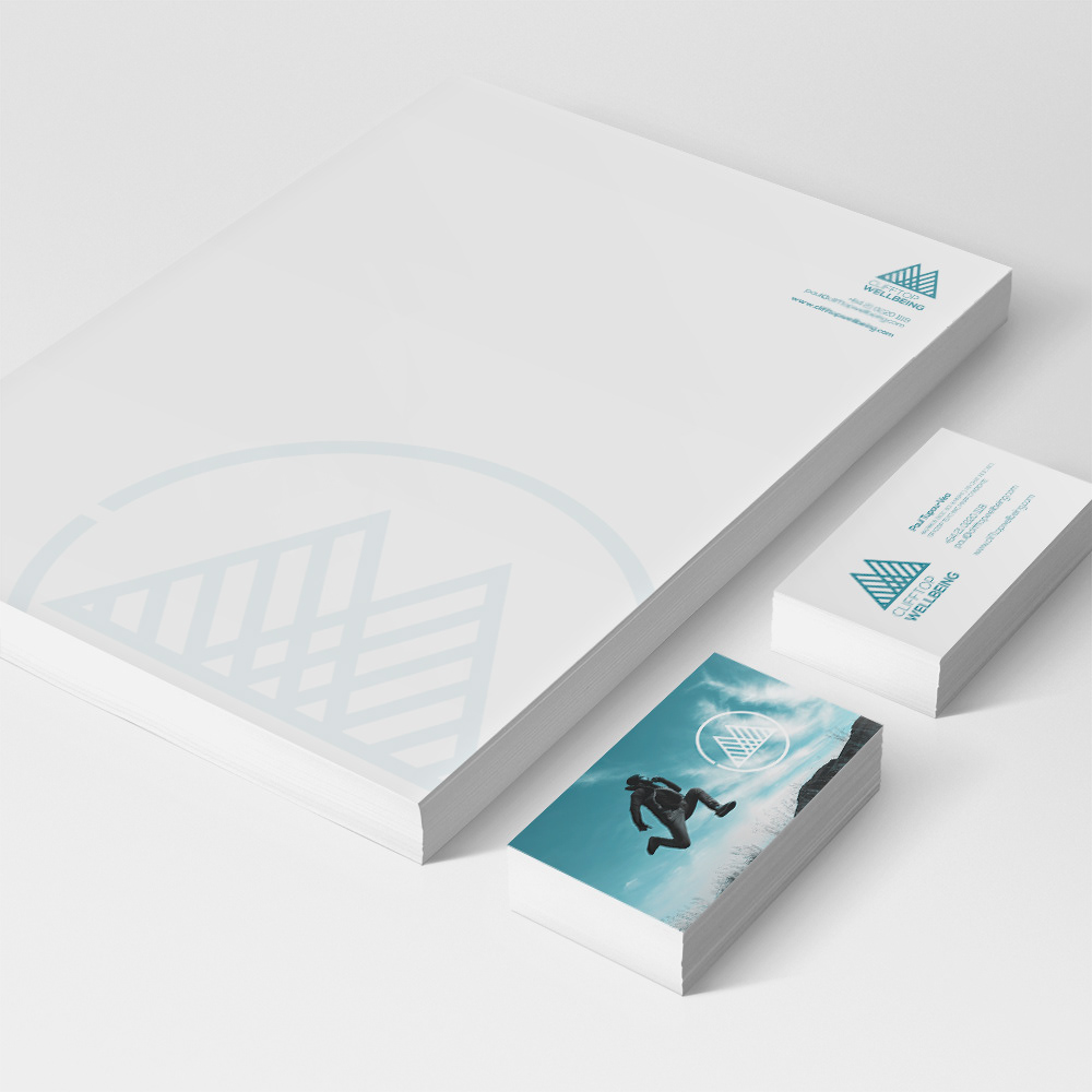
Clifftop Wellbeing offers a range of training programmes and consultancy services for organisations, training teams and staff in the science of wellbeing and positive psychology.
For the brand we wanted to create a strong image which not only related to the 'clifftop' aspect of reaching for your peak (through the use of the mountain range) but also show resilience and strength (through a strong triangle shape) while incorporating traditional cultural symbolism through the use of the weaved lines which emphasizes connections and bonds, the sharp points denote sharks teeth, which in polynesian tatau (Tattoo) which shows protection, fierocity, strength and determination.
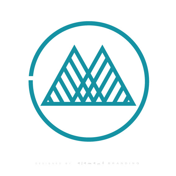
The circle version of the logo, drops the type from the logo and introduces the circle 'Porowhita' which culturally shows life consisting of cycles and if you rotate the whole Porowhita logo 180 degrees the circle and mountains make a CW for Clifftop Wellbeing.