
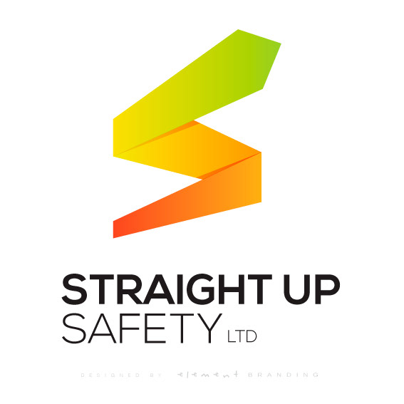
A brand built around the idea of being straight to the point. There is no compromise with safety and this is depicted in the design. The 'S' is symbolised into an arrow, showing a way forward and a leader to follow in the industry.
The colours were chosen using the traffic light theme. This further emphasizes Straight Up Safety Ltds standards of do's and don'ts in safety (stop and go).
